How to Find Inspiration for Your Brand Identity & Logo
Design
Brave People
Published:
11.20.2023
Read Time:
4
Min
Heading 1
Heading 2
Heading 3
Heading 4
Heading 5
Heading 6
Lorem ipsum dolor sit amet, consectetur adipiscing elit, sed do eiusmod tempor incididunt ut labore et dolore magna aliqua. Ut enim ad minim veniam, quis nostrud exercitation ullamco laboris nisi ut aliquip ex ea commodo consequat. Duis aute irure dolor in reprehenderit in voluptate velit esse cillum dolore eu fugiat nulla pariatur.
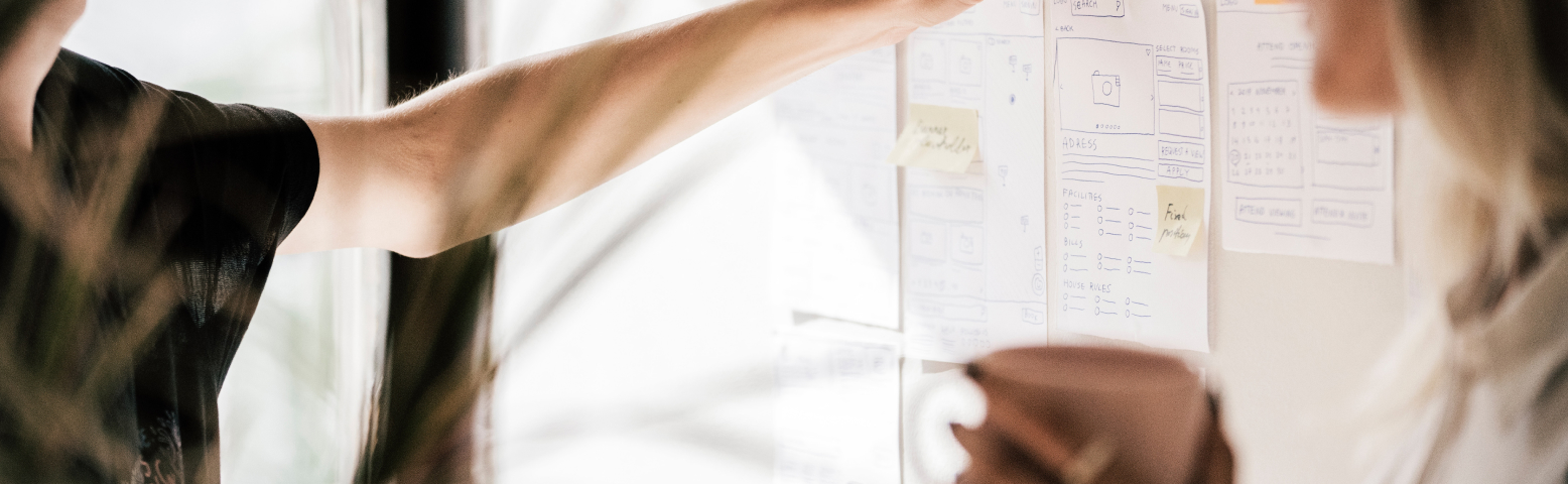
Example: A business wants to redesign its e-commerce website. By analyzing user data, they discover that a significant number of users abandon the checkout process on a specific page. With this insight, the design team decides to simplify the checkout process by reducing the number of form fields, resulting in increased conversions and improved user experience.
Regardless of if you’re starting from scratch, or looking to revamp your current branding, it can be challenging to craft the perfect brand identity, and to encapsulate that into the perfect logo.
Sure, you can spend countless hours scouring the internet for the “perfect inspiration,” but if you don’t know what to be looking out for, then it’s hard to know when you come across the right “aha!” moment.
Let’s fix that.
To best understand the process, let’s explore the thought process behind a fitness platform’s logo creation, and then we’ll work backwards to explain what steps will get you there yourself.
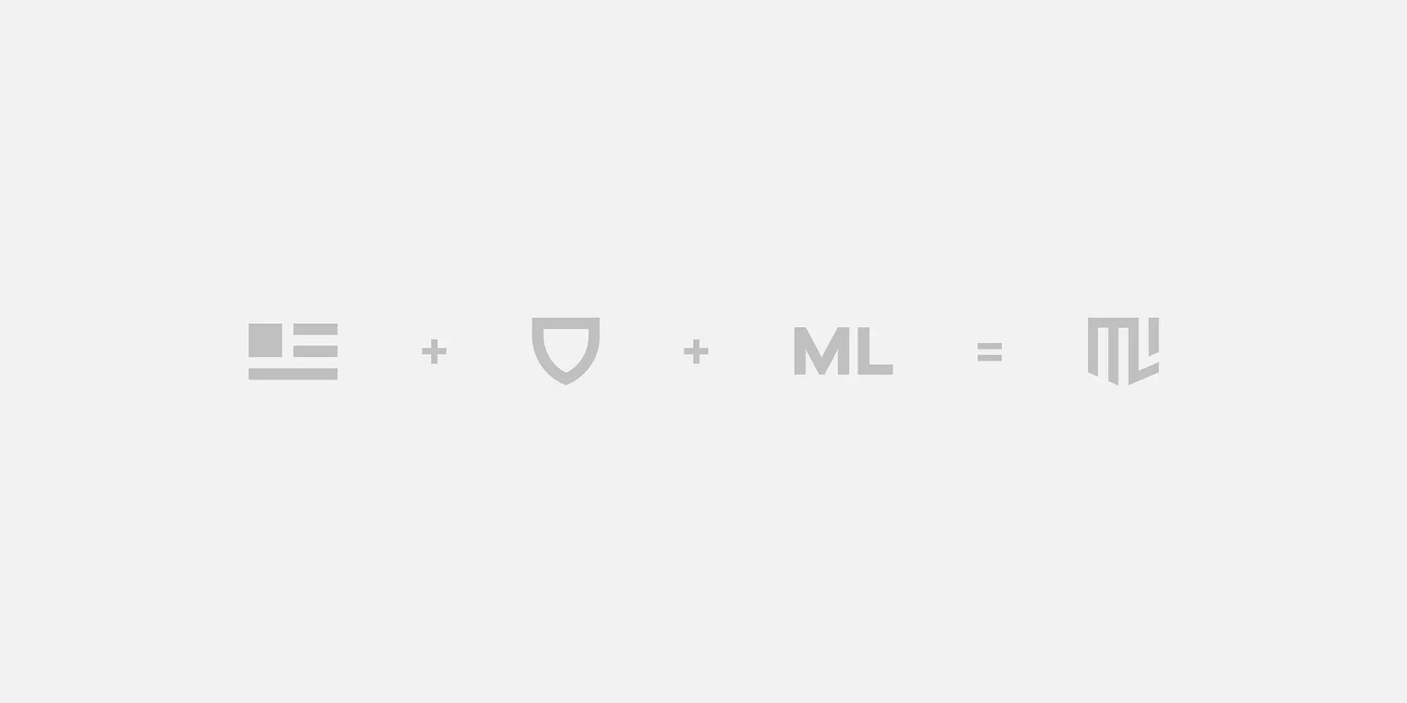
The fitness brand we’ll use as an example here is Mark Lauren, which is a monthly subscription fitness app that focuses on on-demand “safe and balanced home workout routines for long-term results.”
Mark Lauren, both as a brand and as a person, represents a lifetime of dedication to one core thing: movement. This is something that applies not just to physical exercise, but also to being achievement-oriented and to propelling forward.
Mark also has a military background, which was kept in mind when creating his logo. This meant integrating elements — such as earned stripes and a badge of honor, timeless and steadfast — into the primary logomark.
With this integration in mind, Mark’s philosophy of physical movement was translated into digital motion design and birthed the brand’s logo concept you see below.
So what’s the next step from here?
Well, having a concept for a logomark is a huge step, but a bit more work needs to come in before we have a completed logo and identity behind it.
But before we get to that, let’s take a step back and analyze how we got here so far, as promised.
Here are some steps to take at the start of your process:
1. Think about what your company’s mission is
Your company’s mission should be at the core of everything you do, and your logo and brand identity are no exception to that.
The feeling of your logo should reflect what values your brand holds.
2. Personify elements of your brand’s values and personality
Take the time to brainstorm what characteristics you want your brand to be identified with and personify what tangible items can embody those elements.
For example, with Mark Lauren, being achievement-oriented could lead to thinking of trophies or medals, and with Mark’s military background, that could have led to the thought process behind coming up with earned stripes and badges of honor as the tangible personification of being achievement-oriented.
Sometimes doing this step might help shape the literal shape of the logo, like in our example, while other-times this exercise might provide you with a personified element that you might physically put in the logo itself.
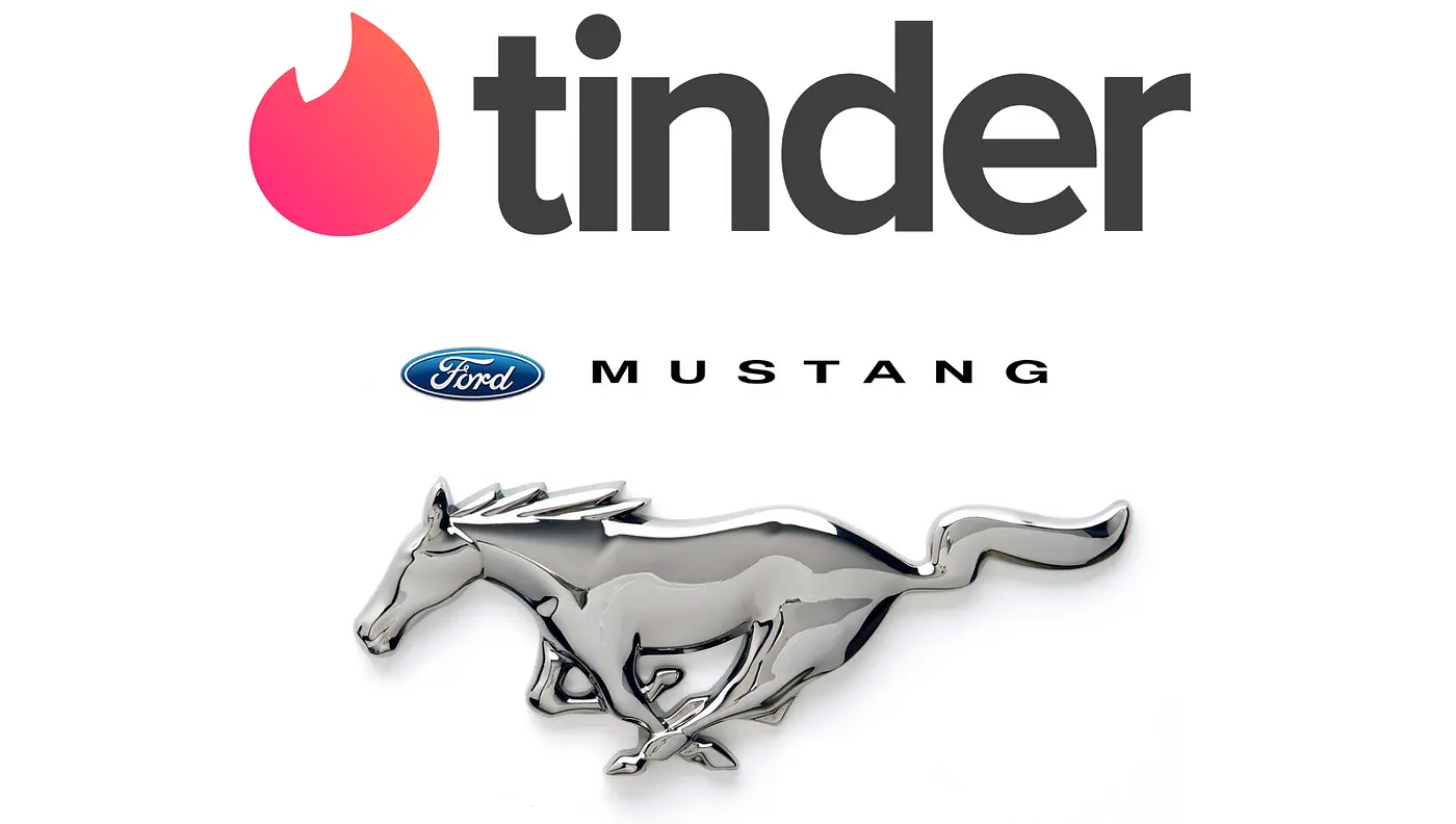
Examples of the item being in the logo itself are seen with brands such as Tinder, which uses a flame in their logo, or Mustang, which uses a horse mid-run.
3. Think of what feelings you want associated with your brand
Once again, brainstorm what these feelings and emotions are. Once you have your list, it will help inform everything else.
Every variation of your logo draft can now be compared to this list. Every time you test out a new font, ask yourself, “How does this logo feel?” If it matches your list of emotions, great- you’re on to something! If it doesn’t, then keep trying again until it does.
The same tactic works for figuring out the color of your logo as well.
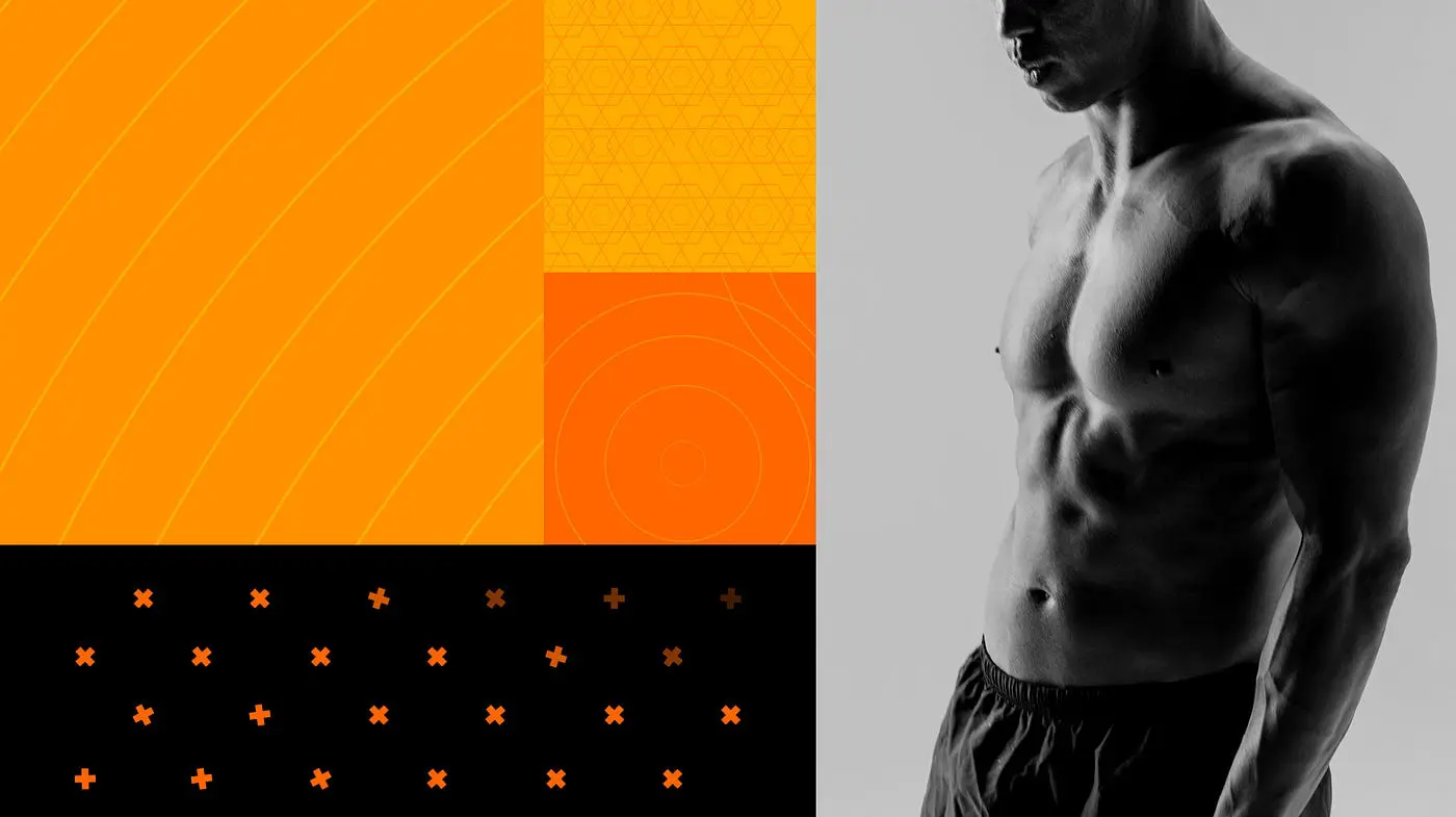
Going back to our example with Mark Lauren, the company is centered around movement and being active, as well as helping improve aspects such as the strength, energy, and confidence of users. Another important element for them was to have an optimistic voice.
With all of these things in mind, the primary color that made the most sense for Mark Lauren’s fitness app to integrate in its brand identity was the color orange.
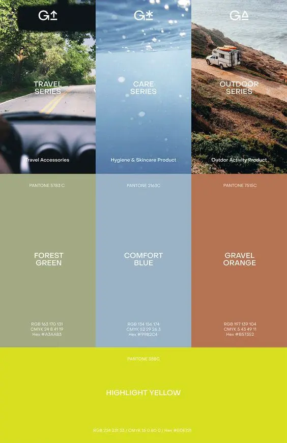
The above image shows components from the branding system that was created for the fitness platform.
The orange was unified with the original logomark inspiration we saw earlier to create the completed logo, which serves as the app’s icon as well.
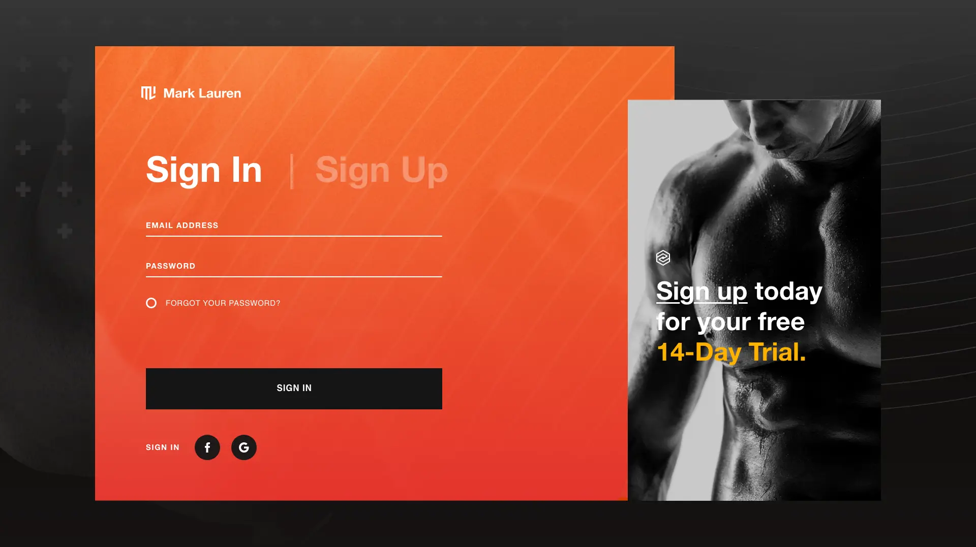
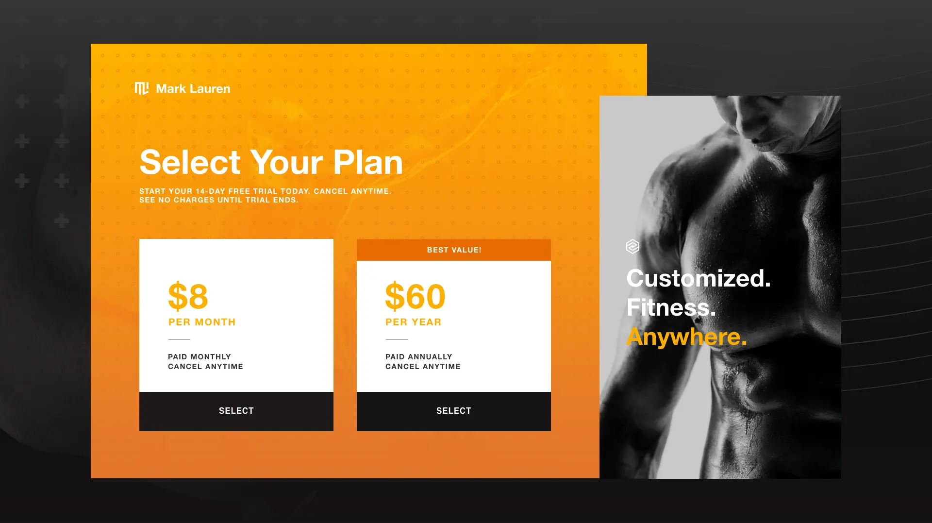
Another aspect of the branding system was to convey the sense of movement that’s so integral to the brand, so instead of using static text, text was brought to life in a kinetic way.
An incredibly important aspect to keep in mind is that your brand identity must remain consistent in every element of your website, app, social accounts, and so on.
Your brand identity is not only the look, but the feel of the brand. So make sure the feeling exists beyond the logo as well.
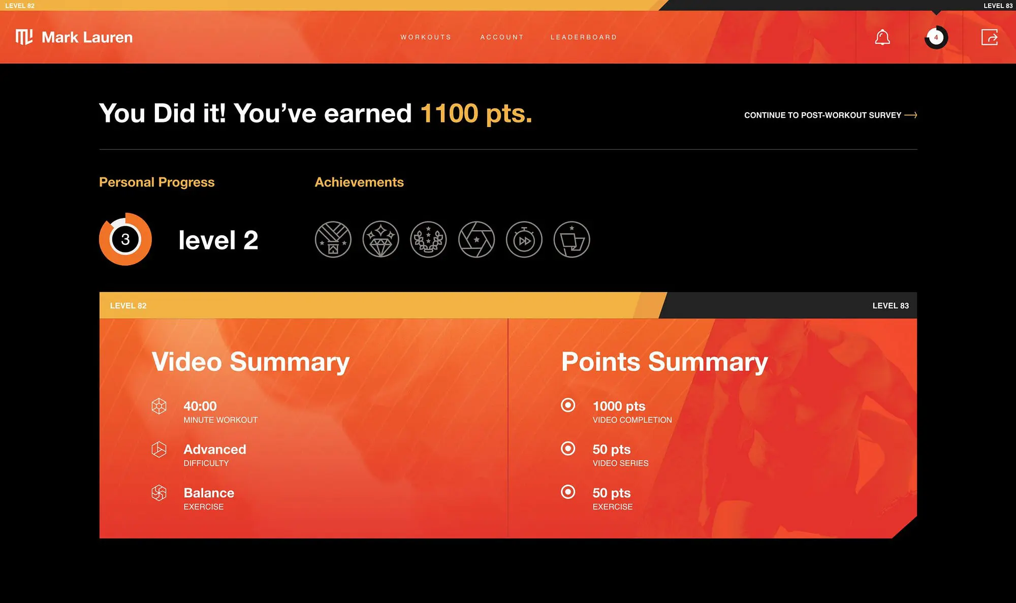
Here are examples of how Mark Lauren executes this on their site:
As you can see, every page has the same consistent look and feel to it.
Now what?
Good question. As you’re probably well aware, there’s not just a one-size-fits-all magic solution as to how the right brand identity and logo design will come to you.
That said, if you take the time — and I mean really take the time — to do the steps above and allow yourself to brainstorm in these categories as much as you can, then I’m willing to bet you’ll have a solid foundation to go off of.
At the very least, you’ll know exactly what you want if you outsource a designer or agency to create your logo and/or branding system. But if you truly are still stuck, luckily for you, that’s why design agencies exist.
Regardless of what route you go, the ability to practice these exercises yourself will help give you the confidence that your brand has a solid and strategic identity behind it when it comes time to share (or re-share) it with the world.
Need a Branding Refresh?
We are Brave People. We help our client partners look ahead to what doesn’t yet exist by bringing their digital products to life and driving shared value for everyone involved.
If you haven’t already guessed it, Mark Lauren is one of the many client partners we have had the joy of collaborating with.
Interested in chatting with us? Feel free to reach out here.